
Vinithra Amarnathan
This apartment is home to a vivacious couple and their delightful young son.
Bold rich color derived from jewel tones, metallic hints and a play of textures from various materials form the DNA of the home and are the design features that give the space its sense of identity. Throw into the mix a penchant for Bollywood and cinema that the couple share and oh it was a ball!😊
Entryway
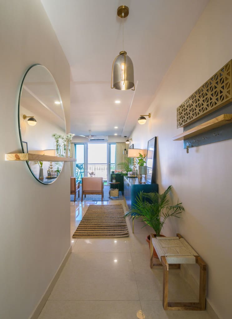
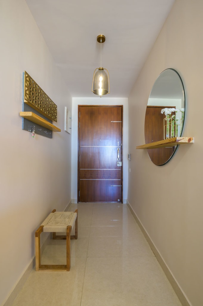
The entryway is a minimal segue with its clean-lined design sensibility that prepares the eye for all that one is about to experience 😉
We’ve used a large round mirror that has a wooden shelf running across its length which adds that element of unexpected and function to this narrow foyer. The sleek artsy woven rope bench is our nod to texture and warmth. It’s easy on the eye and just the right welcome into the space.
Living Area
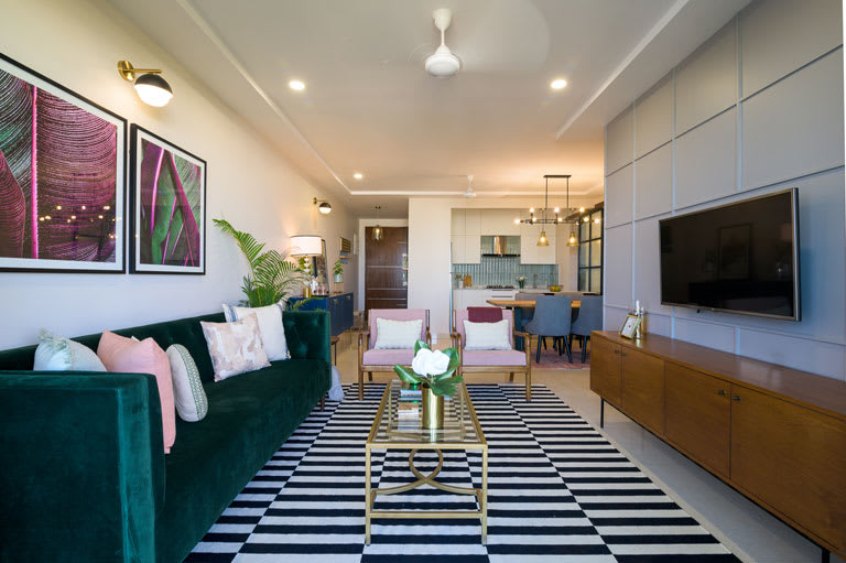
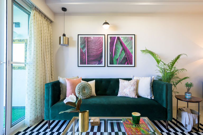
Blush, emerald green, the classic black & white duo and metallic brass accents give this space a bold yet layered persona. The overall look is modern and elevated and gives the space a chic vibe. The tufted emerald velvet sofa in clean mid-century lines paired with the blush and wood tone chairs make for a great combo now don’t we all agree? The striking monochrome geometric rug gives the space a sharp but simple departure from all the colour and brings in balance.😊
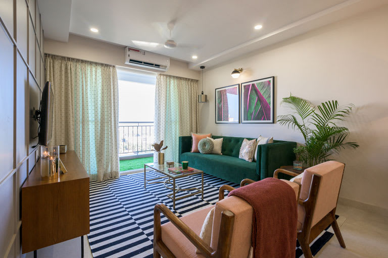
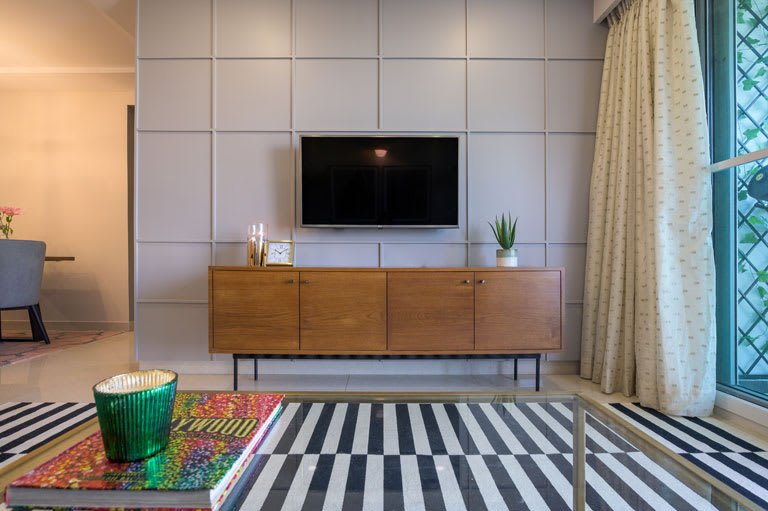
Another favourite feature of ours in this area has got to be the accent wall. We chose a warm grey hue that bathes the TV wall in conjunction with a grid pattern all over. The battened wall immediately elevates the look of the area and gives the space a sense of contrast and depth!
Dining cum Bar Section
Perfect for a little Friday night shindig or a warm family dinner with loved ones.
The light wood raw edge dining table brings in a touch of modernity with its sleek angular metallic black legs
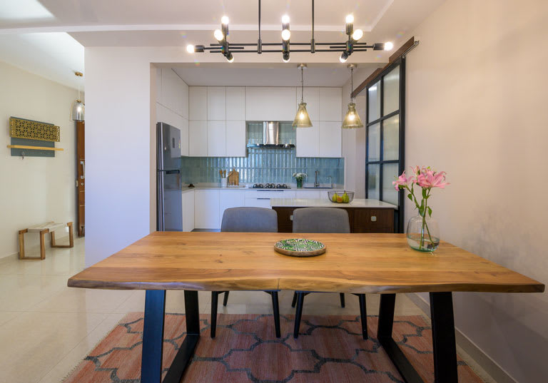
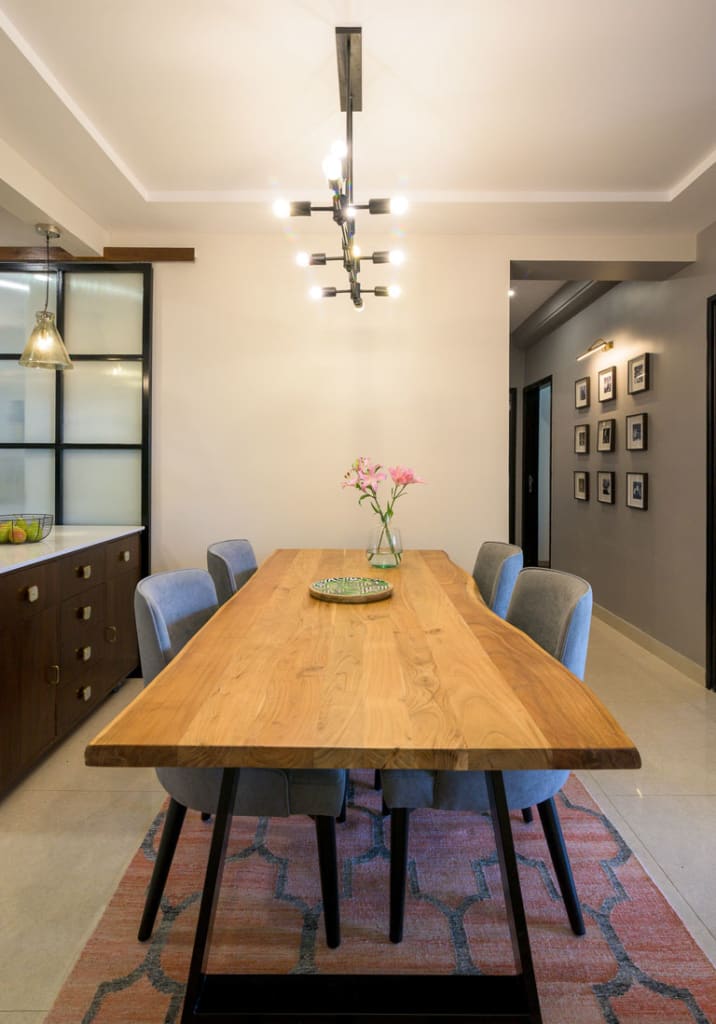
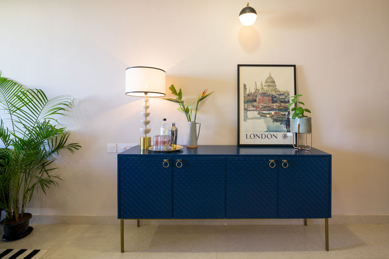
The bar section flanks the dining zone on one side and is a versatile setup. The midnight blue crockery cum bar unit is adorned with an embossed scallop design on its shutters, brass hue legs and dapper brass round hardware – oh so swoon-worthy!😊
Kitchen
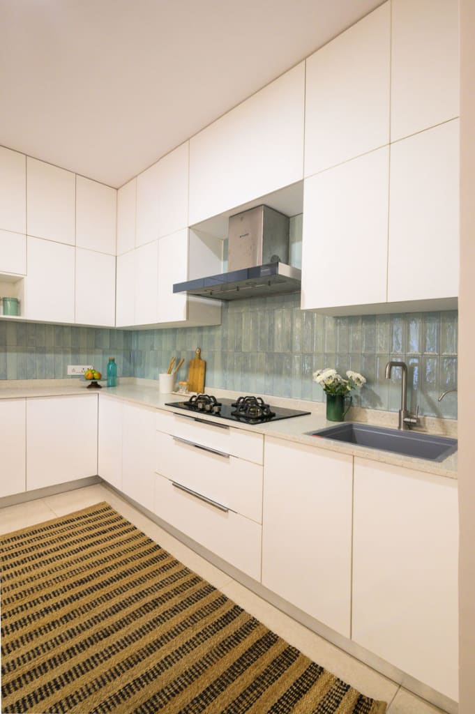
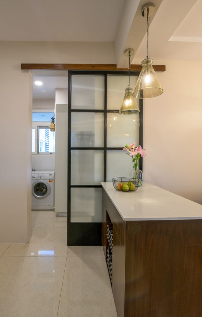
Translucent aqua toned tiles in unison with the simplicity of white. What’s not to love? The vertical stacking configuration of the tiles adds a sense of increased height to the space and with the all-white cabinetry, it’s a winner!

Balcony
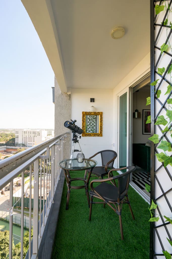
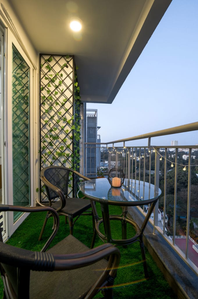
We transformed the balcony niche into a bijou haven. A grass carpet brings in the outdoorsy feel in combination with a compact seating set. String lights in the space exude a whimsical feel and we created a latticed trellis framework with faux creepers to bring in that touch of greenery (that have virtually no maintenance). 😉 The balcony also houses the client’s telescope setup and we also would love to dream of a breezy evening stargazing from this spot.
Hallway
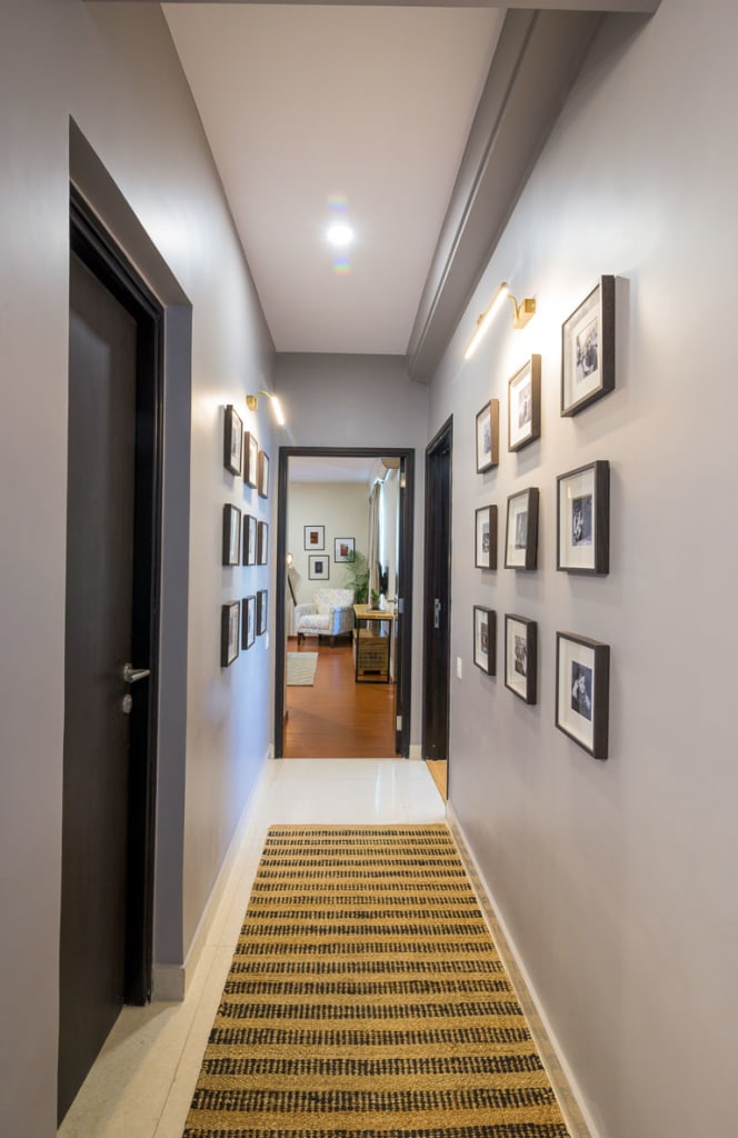
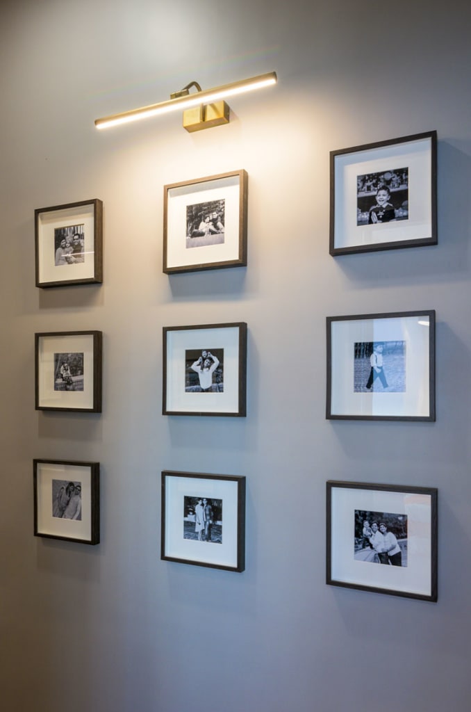
The most common assumption regarding small and narrow spaces is that darker colors on the walls will only make it look smaller, But here the usage of the same hue to bathe the walls up to the ceiling gives the hallway a sense of connection that links it to the larger living section of the apartment. The grey tone in the constricted space adds visual impact and brings in the right amount of contrast against the black and white photos we added.
Master Bedroom
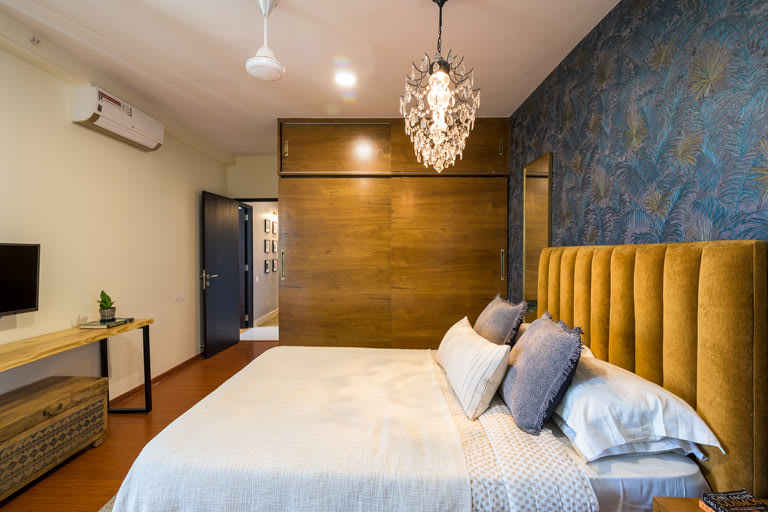
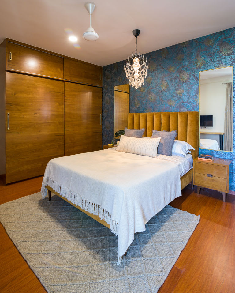
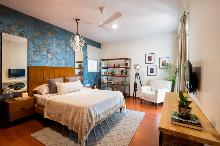
The master bedroom was intended to be a personal retreat for the couple and one that embodied the things they most love – books, music, Bollywood and color😉
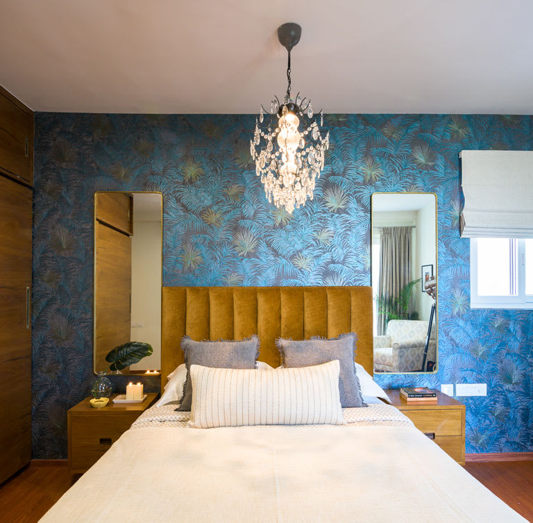
The pièce de résistance in the space is the hands down the Roberto Cavalli Ferns wallpaper that makes for the perfect backdrop to the gorgeous ochre upholstered queen bed that we’re swooning over. The vertical stitch on the headboard gives the bed an impression of increased visual height. Match made in color heaven!
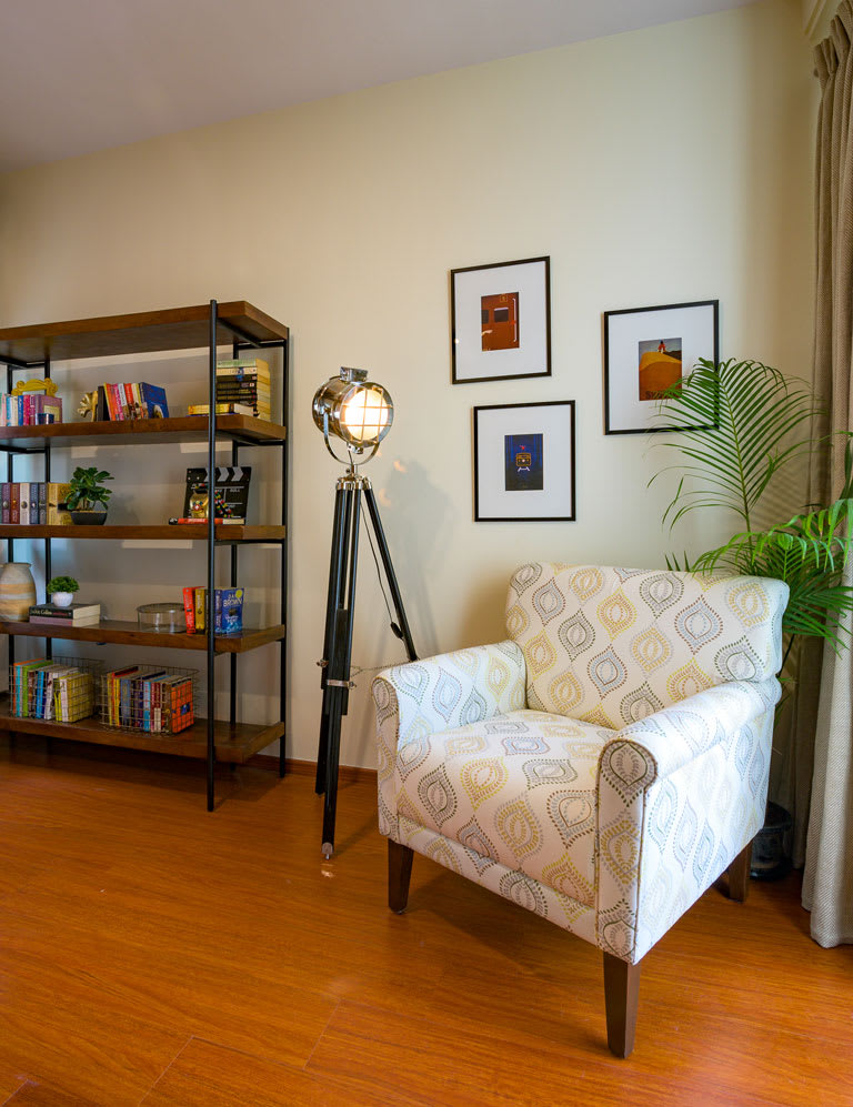
A snug nook with an upholstered reading chair in a soft beautiful pattern, minimal wall prints that speak to the couple’s love for all things Bollywood and a camera light floor lamp which was on the list of must-haves for the lady of the house come together to complete this vignette in the master.
Kid’s Bedroom
This space was designed for the 6-year-old in-house superhero! May we say it’s probably one of our favorite kid’s spaces in a long time.
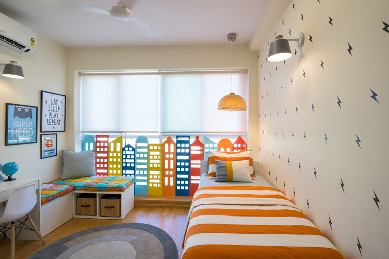
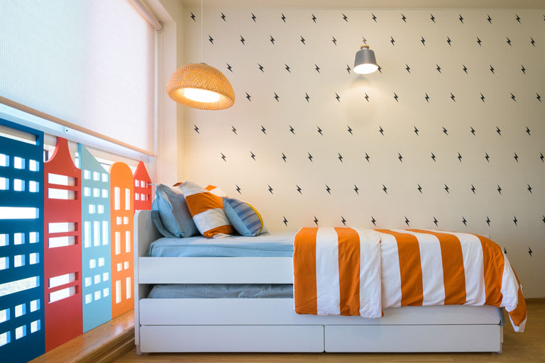
We kept the overall base neutral with pops of color to bring in that vibrancy to the space. The bed is a sleek white Slakt trundle bed by Ikea and is perfect for those sleepovers! The bed wall has been covered in black thunderbolt decals (each stuck with love by hand). Decals are an inexpensive and quick way to uplift the way a room wall looks instantly!
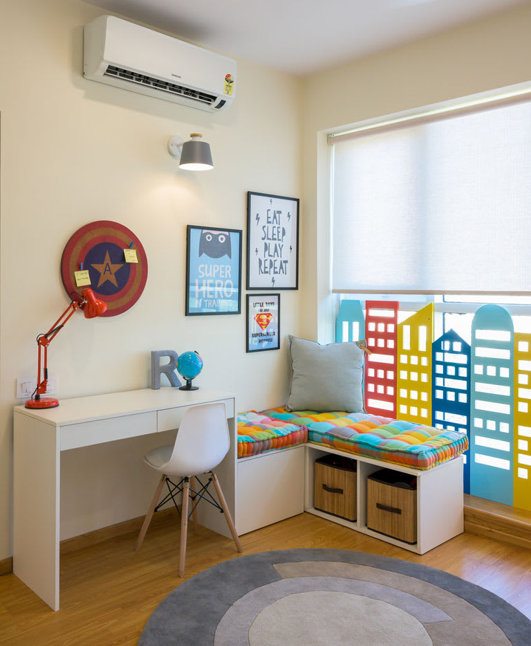
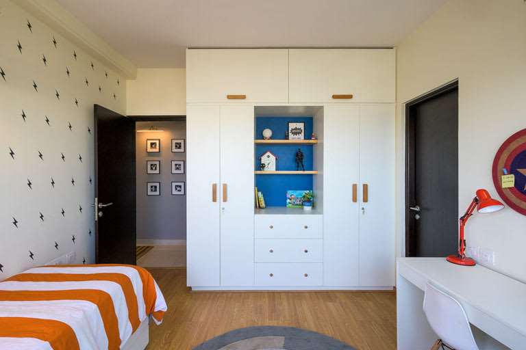
Superhero-inspired prints adorn this corner and gives it a fun feel. The wardrobe section on the opposite wall in white has wooden hardware and an open section to display items, store books and bric-a-brac that the child can easily access.
Guest Bedroom
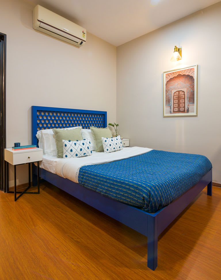
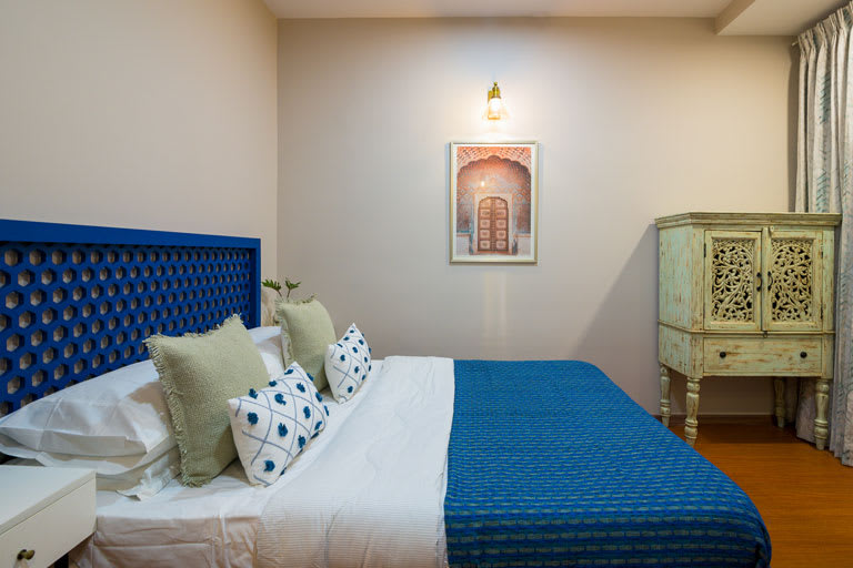
This bedroom had a neo-traditional sentiment to it that would be used more frequently by the couple’s parents. The walls have a soft taupe shade that adds warmth to the space instantly.
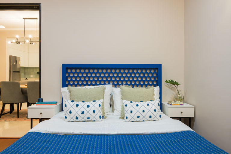
The bed has a hexagonal jaaliwork pattern as a headboard and the whole piece has been painted a deep blue tone which gives the space a common thread of hue. The bedside tables are simple white top, black metal legged units with brass hardware.
The Modern Jewel Tone Inspired Apartment has been designed with a vision that ensures that the client’s needs have been understood at an intrinsic level. Designing this home has truly been a stimulating experience which was a love affair with color at many levels!
ALL IMAGES COURTESY : WEE SPACES
WEE SPACES
Social Media Handles :
Instagram : https://www.instagram.com/weespacesinteriors/?hl=en
Facebook : https://www.facebook.com/Weespacesinteriors/
Website : http://wee-spaces.com/

